Colored Pencil Practice

The two assignments above we were to practice drawing basic 3-D shapes and a fruit to get comfortable with blending, color and shadows/highlights with colored pencil.
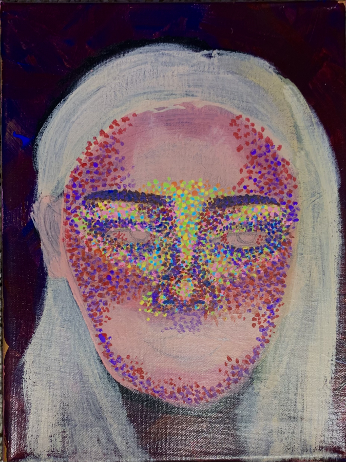
Colored Pencil Reflection Project
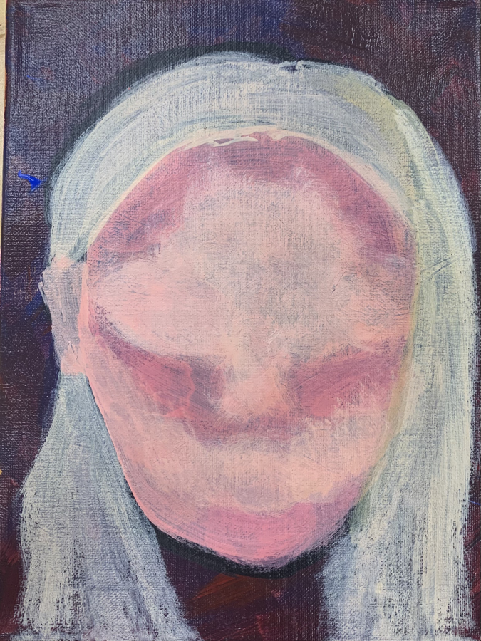
Above is the progression of my piece starting from my personal reference photo, to my compositional and colored sketch and then my progress over time. Below is my final piece.
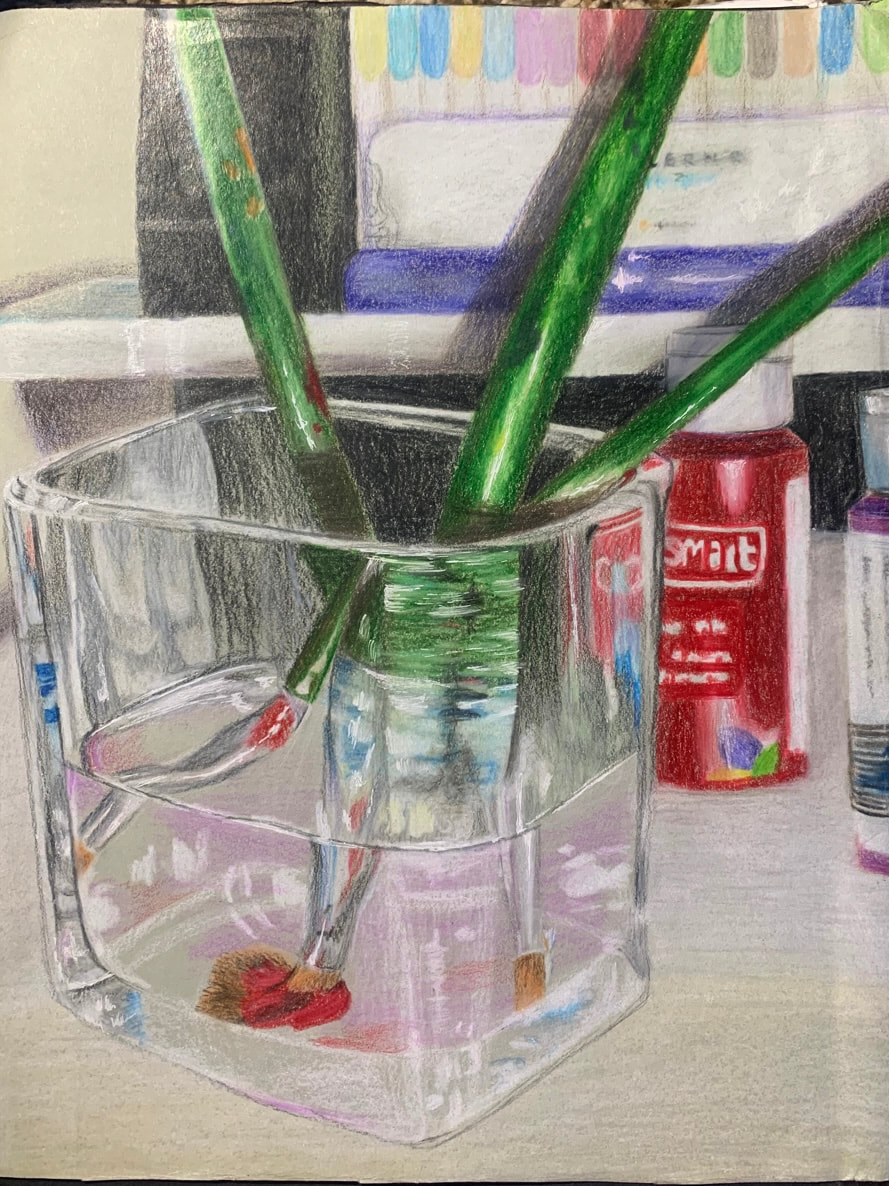
For this assignment I was told to draw a piece using colored pencil that reflects myself as a person but also has a physically reflective aspect itself. To brain storm for this concept I came up with twenty different ideas, chose my favorite and started executing compositional sketches and a colored sketch before actually starting my final piece. I chose this idea because i love to paint (its my medium of choice) so I thought the paint brushes in the glass full of water was a subtle but good way to represent this and I've never attempted to paint or draw glass before so i knew it'd be a challenge and good practice. That being said, it was definitely a challenge to draw this glass. I've also rarely worked with color pencil before so it was a new medium to get familiar with. I started by doing a light sketch in white to mark my shapes and shadows and then background. When it came to drawing the glass, i began with the bright highlights and other variations of white before adding the brushes and any other color in the glass. I did have to learn the hard way that it is very difficult to get a nice pigmented white over top of any other color but I got the hang of it eventually. For a first time at a couple things (working with colored pencil, drawing glass, etc.) I'm pretty proud of this piece and how much I learned about this medium. I'd say it was good for me as an artist to finally get some work done with pencils, maybe I wont be so scared of it anymore. Practice makes perfect!
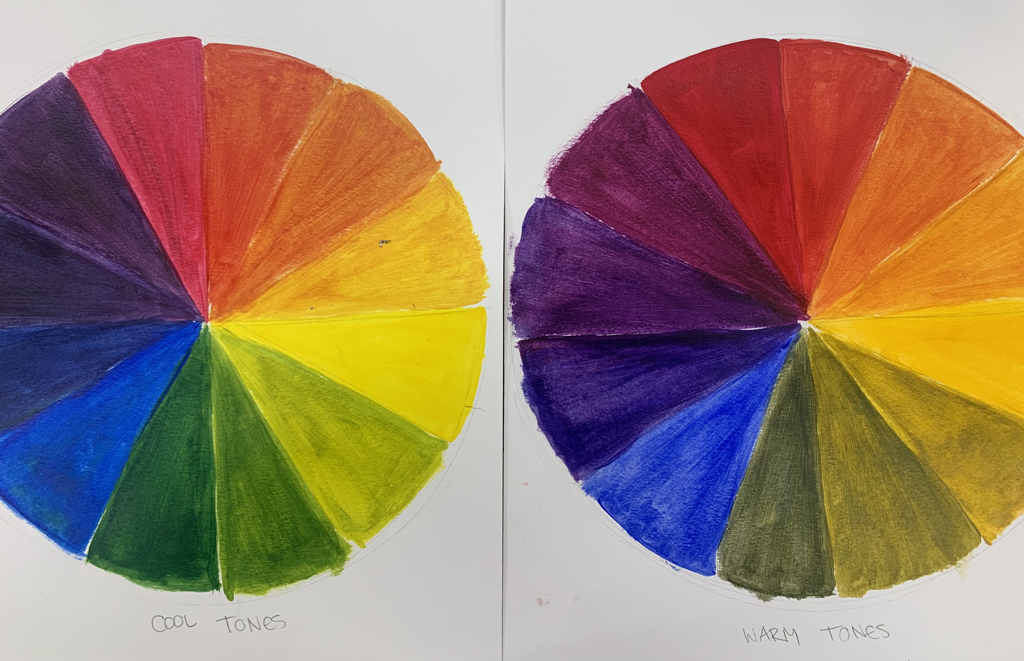
Acrylic Color Wheel
Below is a acrylic warm up we did where we only used the 3 primary colors to create the color wheel. On the right we used the warm toned primaries and on the left we used the cool tone.
"Interior Space" Acrylic
Below is my beginning process of finding a reference photo, making my sketches and then starting my piece.
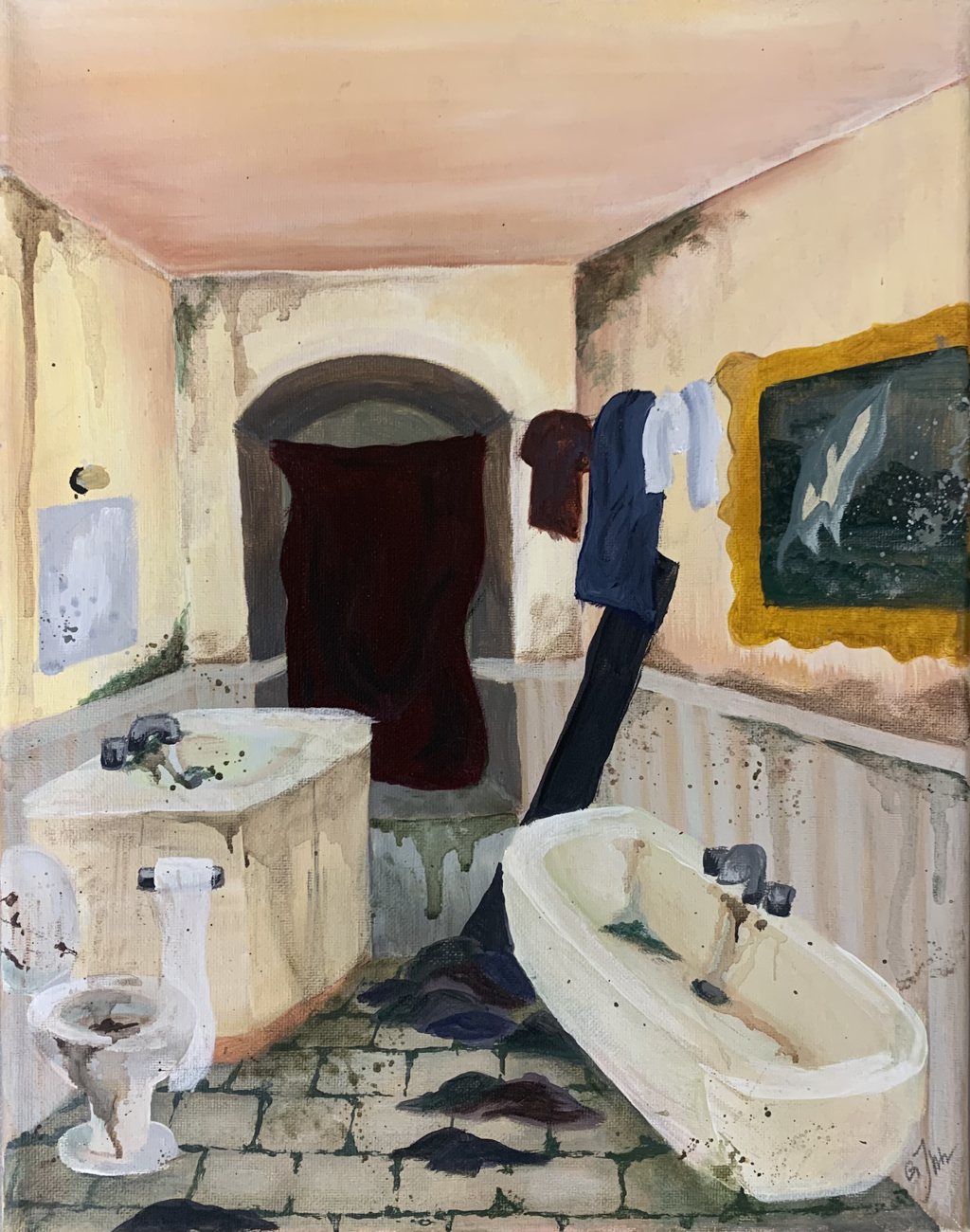
For this assignment we were given the prompt "interior space" and above is my piece I created called Dirty Bathroom. When brainstorming I came up with 20 different ideas but I just really liked the concept and endless opportunity that came with the idea of a dirty bathroom. I didn't want to just paint a bathroom though because people would just look at it like "oh cool its a bathroom.".... the dirty part was the part that would make people look at it and be intrigued or think "ew" which would be a good kind of ew in this case. This really challenged my 1 point perspective because I knew if my perspective was spot on I wouldn't be able to fit all 3 of the essentials in a bathroom, a sink, a toilet and a tub. I felt I really needed all three in the piece because I could make those three things so dirty. I tried a new technique that I've used before on different material, never had the chance to incorporate it into a canvas painting yet, which was to add water to the paint much like you do when priming your piece in the beginning and i used that to create a dripping water stain effect in the toilet and tub and sink. I also added this effect in several other places like the wall, just wanted to make everything look as dirty as possible. I say this technique was really effective and definitely a good move for me to add that detail. Acrylic is my medium of choice so I was already very familiar with this medium and how it works but I did learn some about color theory and contrast when making this piece. This piece definitely isn't my favorite thing I've ever created but I do like it and love the idea, I'll probably come back to this concept at a later date.
Self Portrait
For this project we were to pick a picture of our self to paint using acrylic paint. The point was to be creative not basic!
Above is a slide show starting with my final piece and my reference photo, followed by my progress pictures. I first started going a complete different direction by basically just painting my reference photo with no creative aspect. Once I had got that going I changed my mind and I wanted to try a new technique that represented my personality. That’s when I decided to use these colorful dots to build my piece. I really like this technique and the fun colors. I really had to trust the process though because as you can kind of tell, it really didn’t all come together until I added all of the color dots. I used the brighter colors like pink, yellow, orange, green and light blue for my skin undertones and then went in with the darker colors red, purple, dark blue and brown to really build the depth and add some shape. Whenever I do portraits I think of it like applying makeup. Where would I put the bright concealers and foundations to highlight my face? Where would I put the contours to contour my face? Which one comes first? I think looking at it that way really helps. I didn’t struggle too much with this piece it was fun and different. Like I said I just had to trust the process and of course the hundreds of dots were a bit tedious. I have always struggled with self portraits though in the sense I believe you never truely see what you look like. Like somebody can see you and recognize every proportion and detail but it’s hard to see looking at yourself. I need to work on proportions. I definitely will keep experimenting with this dotting technique since this was my first time trying it and I really liked it. I also plan on practicing portraits and self portraits more.
Oil Paint
Above are our practice assignments for oil painting starting with a brush painting of a lollipop in a wrapper, then an apple I used a pallet knife to paint, and lastly a warm up where we created 100 different colors using only primary colors to become familiar with mixing oil paint.
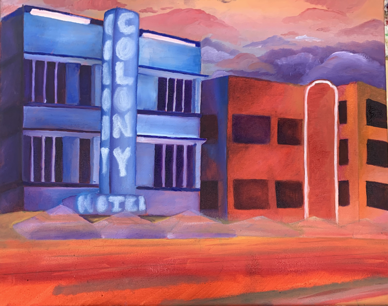
Oil paint landscape
Above is a landscape in oil paint. This street is in Miami Florida and is one of the most popular tourist attractions because of the bright, colored LED lights that are lighting the street and the buildings. These hotels are actually white but in the evening/night appear to be blue and red because of the lights. I really like how this piece turned out, however now that I’ve done it it would not have been my first choice to do using oil paints. The oil paints made it very easy to blend the shadows and lighting but because there are so many straight and precise lines for the architecture of the buildings, the paint being wet made this very difficult. Trying to put two different colors in a straight line next to each other took a lot of patience because they would start to blend due to the paint being wet. But, on the good side, I did pull it off and I really liked the bright colors and texture I was able to create using the oil paints. It’s hard to tell through a picture but the palm trees were the last things I did and I was really able to build the paint and give it texture. I gave this painting away as a Christmas present and they really enjoyed it. I went into this project not liking oil paint but I’m definitely becoming more of a fan.
