Colored Pencil Forms
Above we practiced getting comfortable colored pencil and using the medium to create different 3D shapes. This assignment helped me to understand how to blend and create shadows and highlights with colored pencil.
Colored Pencil Fruit
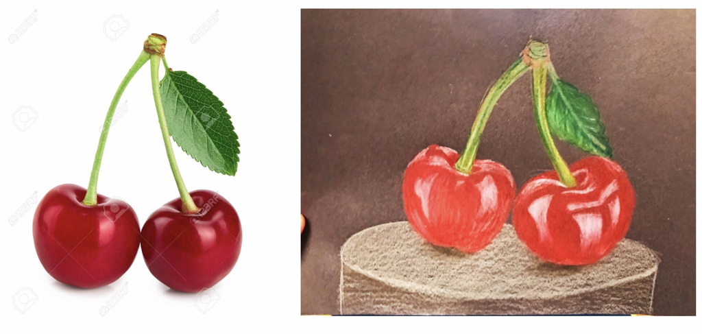
This was our final project to show off what we learned about using colored pencil. This drawing honestly is not my favorite I started by putting a base of red down so it ended up being really difficult to throw in other colors and highlights over top. But the drawing isn’t terrible and it taught me a lesson.
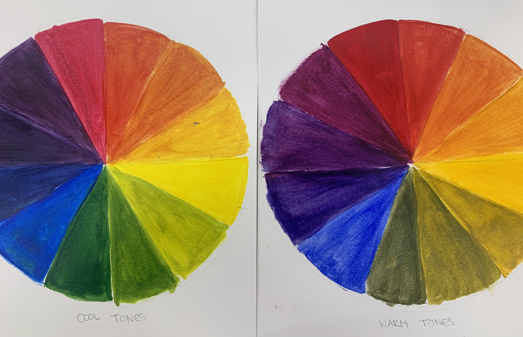
Watercolor Values and Forms Chart
This was a practice assignment i did to get comfortable with watercolors. Students were asked to practice different tints and shades or watercolor and practice painting shapes to get comfortable with shadowing.
Watercolor Fruit
For the assignment below i was told to paint the same fruit in four different color schemes using watercolor. This was a fun assignment and by the time i was done with all of the paintings i was feeling pretty confident with watercolor. I have to say the monochromatic Pear in all red on the top right below is my favorite because even though i was using one color i feel i did really well with the different values and shadows while also getting detail in.
Watercolor Landscape
Below is a slideshow of my process including my reference photos and my in-progress photos.
This is how my final piece turned out...
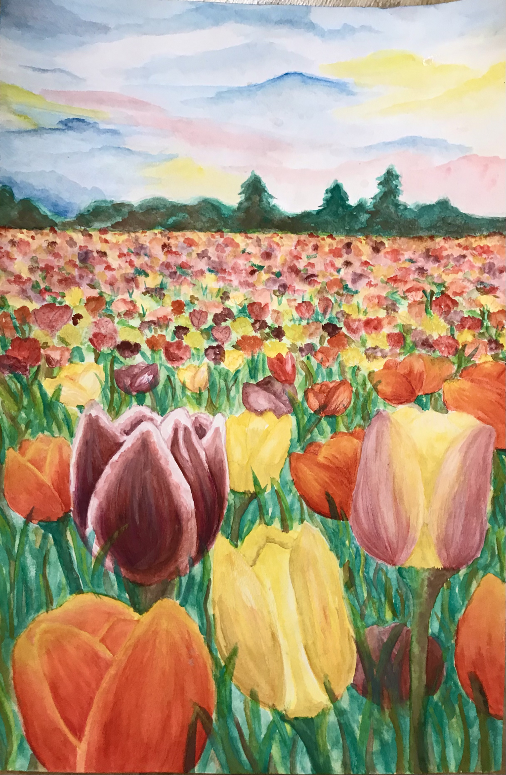
Because of the intense changing depth in my piece, putting dry color down then adding water over top seemed to work best for the flowers further away. After the back flowers dried I would also take a damp brush and lightly swirl the colors together to blend them to further enhance the perception of the depth. Using transparent colors proved to be very important for later going back and adding detail. This technique was an important part of my craftsmanship to add those details to the flowers closest to the front. Color was also a huge part of the success of my piece. The bright and varied colors of the flowers helped make the painting stay bright and the tone upbeat to match the energy of the tulips. The variety of greens in the grass was also important for the realism of my piece, unfortunately, I wish I would’ve done the grass differently. I wasn’t thinking about how grass was more than just green, but also browns and yellows. I also wish I would’ve planned better on what I needed to paint first to help with layers and the background. I have to say I learned a lot about watercolor, like how it is not my favorite medium. I am used to and prefer to work with acrylic paint where it is very easy to paint over top of dried layers and create seamless blending. With water color, those things prove to be much more difficult. But, tulips have an important meaning to me and my family and I’m glad I chose to paint them. Even though watercolor is not my favorite, I would consider this piece successful for me especially for never really working with it and hope to get more comfortable.
Hundertwasser Inspired Piece
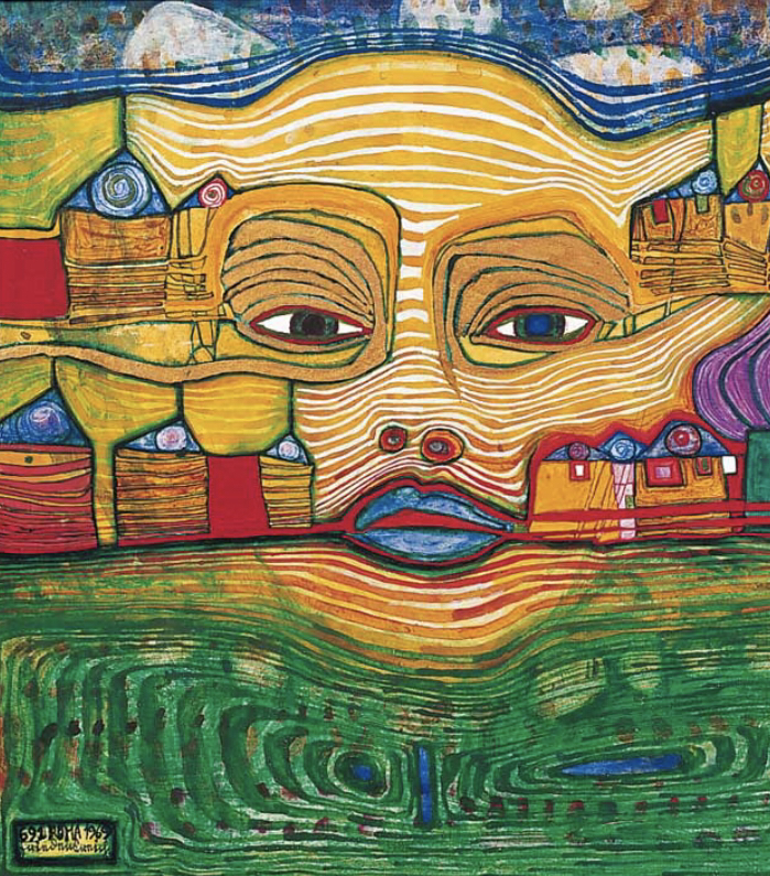
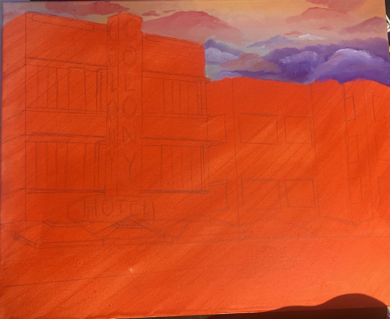
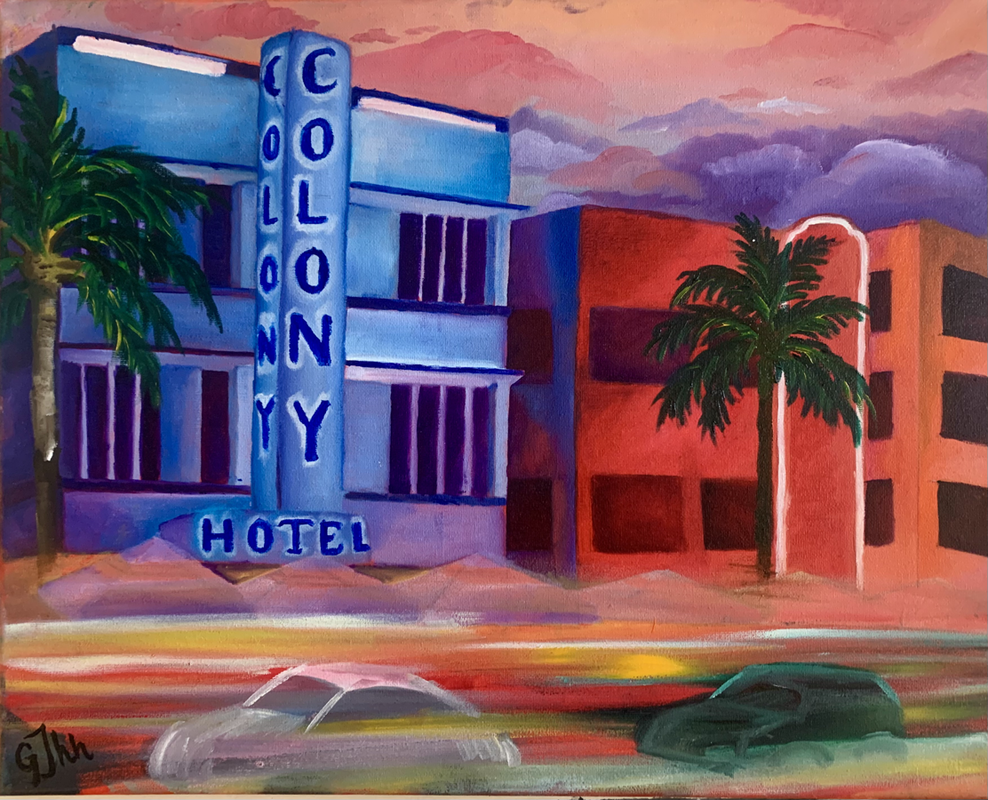
This assignment was to create a piece inspired by famous artist’s Friedensreich Hundertwasser. Above are 2 examples of his work. His pieces have bright colors, lots of patterns, very 2 dimensional and are described as “child-like” because of his wild youthful imagination he portrays in his work. When choosing what I wanted to paint, Downtown Chattanooga (TN) was the first place that came to mind and that’s what I stuck with. I was born and raised in downtown Chatt until I was around 7 and I always thought the area was so full of life, artsy and fun. Perfect choice in my opinion for this type of art. Below are my reference pictures of downtown Chattanooga and my process from colored sketch to final piece.
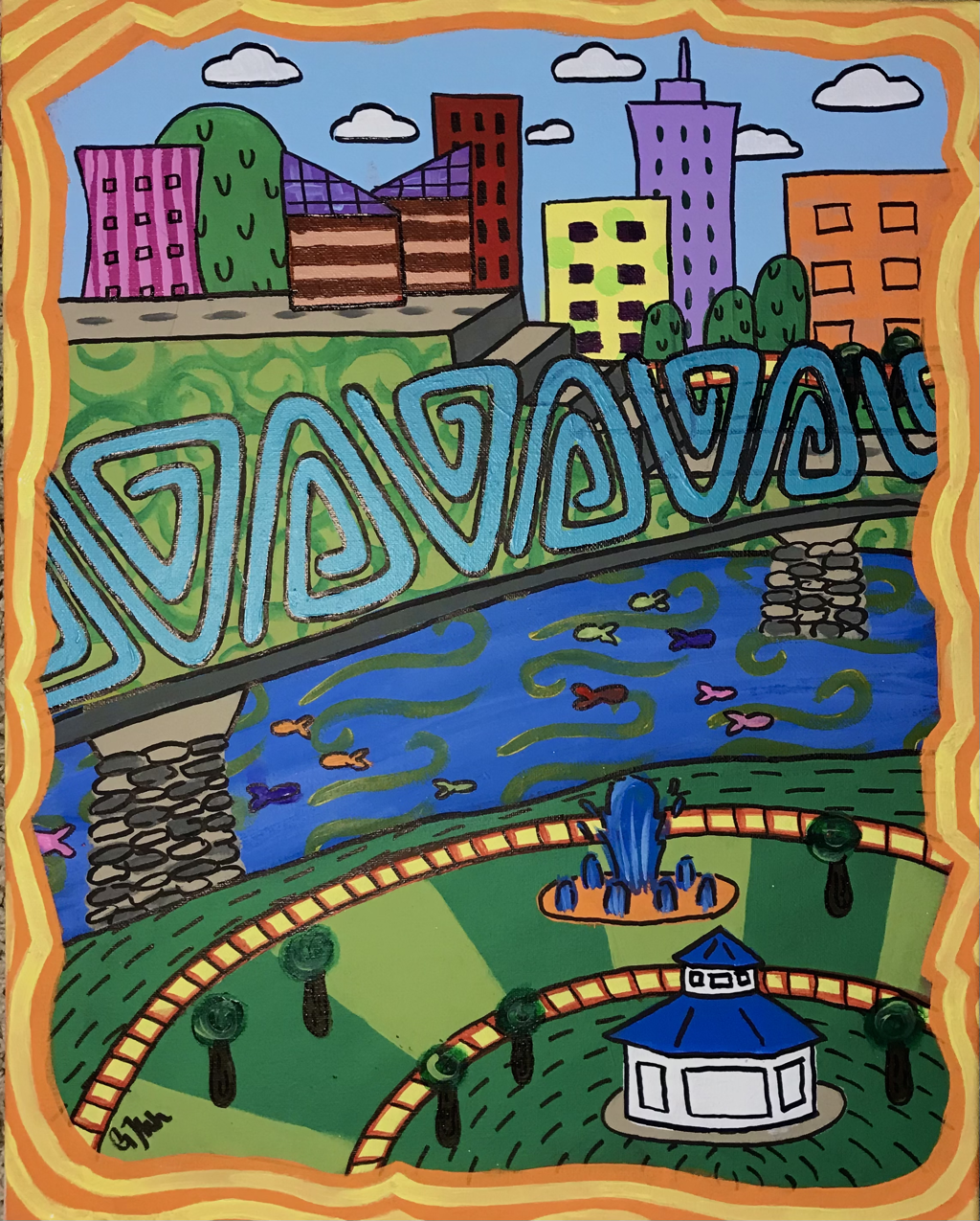
I’d say my craftsmanship of my piece was just the right amount of messy and carefree yet still portrays the image in mind, which I say represents the Hundertwasser’s style as well. He painted freely and let his imagination run but you know what you’re looking at in every piece, just like mine. I chose bright colors that contrasted well almost to overwhelm the viewer to where at first glance you don’t even know what to look at. Specifically enough I’d say one of my favorite color choices I made was the yellow sidewalks with red lines. It was a great contrast to its surrounding and a real pop of color. I do have pattern in my piece but I’d say not as much as Hundertwasser puts in his; I was far more inspired by his use of bright and fun colors than his patterns used in his work. The bridge in my piece probably stands out the most in my piece considering it’s the biggest part of the piece and separated from the chaos at the top and bottom of my painting; but like I said I really wanted to attract the viewer in a way where they would look at every part of my piece. The border was the last thing I added to my piece and I’m very happy with the colors I picked, I think it balances out some of the more duller colors I used for the grass and water and matched the bright colors of the buildings. The shape of my border was also fun to create and see and added to the funk of the piece. Overall I didn’t have any issues with this piece, there were certain points where I’d wished I painted one before before I tried to paint another but it all came together and I’m very satisfied with the final look.
Oil painting Warm ups
This warm up was to test our skills with mixing and creating colors using oil paint. This is 100 squares of 100 different colors only made from the primary colors blue, red and yellow.
This warm up was to paint a fruit with oil paints. I went with a pear. I wasn’t too familiar with working with oil paints but I think it turned out good enough for such little experience.
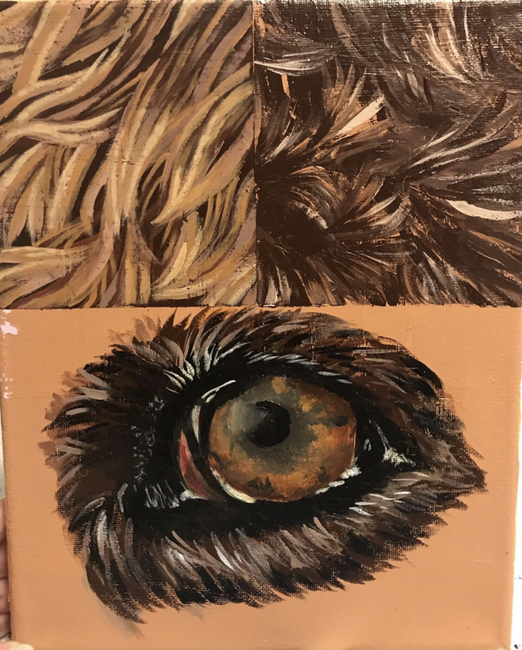
Here is the final warm up to prepare us for are final piece in the oil paint unit. The assignment was to paint two different furs and an animal eye using oil paint.
Animal Oil Painting
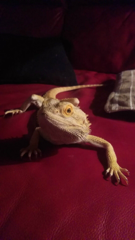

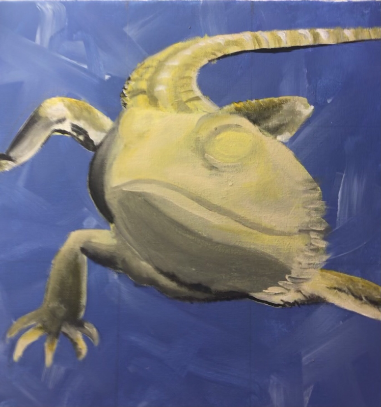
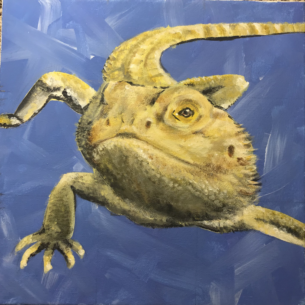
For my final piece in our oil paint unit we were to paint a pet of ours, I chose my bearded dragon JoJo. JoJo passed a few years ago now but he was one of my favorite pets I've ever had so I decided to paint him. I'd say he was a bit of a challenge to paint because he has scales instead of fur; I have a lot more practice painting furry animals than i do with scaled animals. My craftmanship was definitely more messy than other pieces I've done but on purpose. For one, i didn't have the clearest picture of reference because it was so long ago and another reason is because I wanted to go at this assignment with a more relaxed approach. I tend to stress myself out when trying to copy a photo exactly and the tiniest things wont look exactly like the picture. My end goal was to capture JoJo but not perfectly, a more relaxed paint style where you know exactly what you're looking at but it doesn't look like a picture taken on a camera. I enhanced a lot of the colors in his scales because other wise his most pronounced colors would be a very neutral beige. I started by laying out basic shapes of his colors and shadows with the paint, really enhancing his yellows, browns and oranges. Then I went in and really tried to capture the texture of his scales while detailing. I'm used to painting with acrylic so working with oil paints I had to be very patient. The colors drying slowly was useful for my steps I mentioned when I was laying down basic colors and shadows; the colors blended nicely. It was trying to do the scales when using oil paint became difficult. However, i do like how my piece turned out and i really wouldn't change anything about it. I plan to try to practice more with oil paints.
